
Data informs our day-to-day decisions. From what type of food we eat to what software we choose to invest in. But we’re not wired to comprehend data easily. We need visual aids, like tables and charts.
Luckily, there are a bunch of online tables and charts maker tools out there that can do the formatting and data entry part for us. Everyone has access to these tools. And everyone uses tables and charts in their content.
However, very few people possess the skill to use those tools to bring data to life, to weave a story out of dull or complex data.
And that’s the secret sauce to engaging data visualization. Machines and tools can’t tell unique stories on their own.
That comes down to us. And this is a skill that can directly affect your business’s bottom line.
So, what do you say? Ready to learn how to use tables and charts in your content strategy? Let’s begin!
Tables vs. Charts – What’s the Right Fit for Your Data?
When it comes to presenting data, it’s essential to choose the proper data visualization method for the job. So, when should you use tables, and when should you use charts? Let’s break it down.
When Should You Use Tables?
- Tables help display exact numbers and values, especially when accuracy is paramount. For example, in a research setting.
- When you must present data that requires specific formatting, such as tables of contents or product catalogs.
- When you want to provide detailed information about individual data points, such as product specifications or pricing details.
- If you need to present data that is easily searchable, such as a directory or database
- If you want to compare products.
When Should You Use Charts?
- Use charts to display trends or patterns in your data, such as sales growth over time or website traffic fluctuations.
- Compare data across multiple categories or segments, such as market share of different product lines or revenue by region.
- Visualize complex data relationships, such as correlations between different variables or the impact of various factors on a particular metric.
- Highlight outliers or anomalies in your data, such as sudden spikes in customer complaints or significant drops in website traffic.
- Show progress towards specific goals or targets, such as using a dashboard to track KPIs or key performance indicators.
- Use charts to explain complex concepts to non-technical audiences.
The Who, What, Where, and How of Data Visualization
 Source
In her seminal book, “Storytelling with Data“: Cole Nussbaumer Knaflic highlights the importance of understanding the context for what you need to communicate. This is the explanatory analysis, or how you choose to present your data.
Context is key – whether you’re writing a blog post or preparing for a sales pitch. And there are a few things you should keep in mind.
The Who
 Source
Who is your audience? The more specific you get, the better. Don’t fall into the trap of generalizing. As Seth Godin said, “When you speak to everyone, you speak to no one”.
After all, it’s better to segment your audience and deliver two different materials.
Knowing your audience will reveal the most effective ways of communicating your data. For example, if you present data to a group of executives, you want to focus on high-level trends and use clear, simple visualizations that quickly convey key insights. On the other hand, if you are presenting data to a group of technical experts, you may need to provide more detailed information and use more complex visualizations.
Defining the relationship that you have with your audience will also help you plan how to incorporate tables and charts into your content strategy. What’s your relationship with that audience? Is trust established or something to be built? Answering these questions will guide your strategy.
The What
 Source
 The goal that you are trying to achieve with your content is also important to consider. Are you seeking to persuade, inform, or educate your audience? Are you trying to inspire action or drive change? What’s the message you’re trying to send across? What do you want people to know? What do you want them to do after seeing your content?
Understanding the desired outcome can help you choose the most effective data visualization and storytelling techniques.
The techniques and tools you use will differ depending on your desired outcome. For instance, if you’re trying to persuade people to buy your product, you might opt for a table with features and benefits and a strong copy. However, if you’re trying to establish yourself as a thought leader – you might want to opt for infographics or industry reports with explanatory charts.
Next up – the tone. Is the content lightweight? Do you want to showcase your success? Is it a more in-depth piece? The tone of your communication has to match the topic at hand.
The Where
 Source
Where will these tables and charts appear? Social media? In a blog post? Pitch presentation? The medium matters just as much as the audience and purpose. It will determine the format, size, and style of the data visualization, as well as the level of detail and complexity that can be included.
For example, when you include tables and charts in your social media posts, simplicity and attention-grabbing are what you’re aiming for. These posts will be viewed on a small screen and compete with other content in a crowded feed. On the other hand, a product sheet table will need to be more complex and detailed to show all the technical specifications of your product.
Likewise, tables and charts created for a blog post may need to be more narrative-driven and visually engaging. In contrast, a data visualization created for a pitch presentation may need to focus more on highlighting key data points and insights.
The How
 Source
Now, let’s dive into the “how” of creating compelling data visualizations. How do you use that data to tell a clear, compelling story?
1. Minimize clutter
One of the most important things to keep in mind when creating tables and charts is to minimize clutter. Avoid adding unnecessary data points, labels, or visual elements that don’t add value to the story you’re trying to tell. Keep your visuals simple, clean, and easy to read.
2. Don’t be afraid of white space
White space, or negative space, is the area between visual elements in a table or chart. If you use it strategically, you can help guide the reader’s eye to the most critical data points and make the visualization easier to read.
3. Use color strategically
Color can be a powerful tool for highlighting key points. The key is to use them with purpose. Want to highlight a data point? Use bold colors to make things pop. However, don’t overdo it. Too many colors will overpower your content, rendering it unreadable.
4. Pay attention to typography
The font and formatting of your text can significantly affect the readability and impact of your data visualization. Use a font that is easy to read, and consider using bold or italics to emphasize key points.
5. Use pre-attentive attributes
Pre-attentive attributes are visual cues the brain picks up on quickly and automatically, such as color, size, and shape. Use these attributes strategically in your text and charts to draw attention to relevant information and make your visualization more engaging.
6. Incorporate a narrative
Instead of just presenting data, tell a story with your visualization. Use a beginning, middle, and end structure to guide the viewer through the data and highlight key insights.
7. Test and iterate
Don’t be afraid to experiment with different visualizations and formats to see what works best for your audience and message. Test your visualization with a small group before sharing it widely, and be open to feedback and iteration.
8 Ideas for Using Tables and Charts as Part of Your Content Marketing Strategy
Visualizing data through tables and charts is an integral part of creating content that resonates with your audience.
Tables and charts make your content engaging and, most of all, easy to understand.
It’s a way of translating data for those who aren’t data analysts. And down the line, it’s a way of establishing yourself as an expert and attracting more clients.
Figuring out where and how to include charts and graphs in your content strategy is the tricky part. No worries – we’ve got you covered.
Here are seven practical and easy-to-follow ideas to help you use tables and charts in your content!
1. Use Charts for Industry Reports
Industry reports are an excellent way to showcase your expertise and provide valuable insights to your audience. But, let’s be honest, reports are packed with complex data. As such, reading through them can be overwhelming.
This is where charts come in. Using charts can help break down complex data and make it more understandable for your audience.
When creating industry reports, whether through a blog post or ebook, don’t cram all the data at your disposal. Filter the data. Extract the main insights and show them. Few people want to see a never-ending table of raw data.
Except for researchers. But that’s probably not your audience when you present industry reports.
Another important consideration when creating charts for industry reports is ensuring the information is accurate and up-to-date. Take the time to double-check your data and make sure that your charts are visually appealing and easy to read.
2. Show Company Milestones With Charts
 Source
You can also incorporate charts and tables into your content strategy by showing your company’s milestones.
By celebrating company milestones, you build a strong brand, get your message across, and attract more customers!
And what better way of showing off important milestones than with a chart?
Using charts to showcase your company’s milestones not only helps to build brand credibility but also provides your audience with valuable insights into your business. By showcasing your achievements visually, you’re making it easy for your audience to understand and appreciate the hard work of building a successful business.
You could use a line graph to highlight how your revenue has grown over time. Alternatively, if you’ve launched a very successful product, you could create a pie chart that shows the breakdown of your product sales.
Now, the perfect way to flaunt your company’s achievements is through social media.
And if you’re looking to showcase your data in style, check out our social media templates! With a variety of customizable options to choose from, you can easily create stunning visualizations that are sure to impress your followers and drive engagement.
3. Use Tables and Charts To Present Customer Case Studies
 Source
As a business owner, you understand the importance of social proof. Social proof makes people trust you.
And sometimes, customer case studies are the best for the job. These provide valuable insights into your offering and process, and they also demonstrate the tangible results your customers have achieved through working with you.
However, presenting customer case studies in a way that is clear and visually appealing can be a challenge. That’s where tables and charts come in.
By using data visualizations to showcase the key data points and insights from your customer case studies, you can make the information more digestible and engaging for your audience.
4. Use Tables And Charts In Sales Pitches
 Source
If you’re in a business where you need to pitch your products or services to potential clients, using charts in your pitches is a must.
For example, if you’re presenting a listing of your products, you could use a table to show the different features and pricing of each product. Alternatively, if you’re presenting a service, you could use a line graph to show how your service has helped other businesses grow.
Using charts in your sales pitches not only helps to make the information more understandable but also adds a level of professionalism to your pitch.
Take your sales pitches from meh to outstanding with Xara’s presentation templates →
5. Break up Lengthy Blog Posts With Charts
 Source
By breaking up your content with visual aids, you can help keep your readers engaged and interested. Charts and graphs can also help illustrate complex concepts or data in a way that’s easy to understand.
For example, let’s say you’re writing a blog post about the real estate challenges of 2023. It’s a tangled topic, full of predictions and trends. Rather than relying solely on text, you can use charts and graphs to show trends visually.
Not only does this make the information easier to digest, but it also makes your blog post look more professional and polished. Plus, if you’re sharing your content on social media, charts and graphs can make your post more shareable and eye-catching.
When creating charts and graphs, remember that they should be clear and easy to read. Use simple color schemes and avoid cluttered or confusing layouts. And don’t forget to label your axes and provide context for the presented data.
Trust me; your audience will thank you for it. And you might even see an uptick in engagement.
6. Use Tables to Compare Products
Here’s the deal – customers want to compare products side-by-side without having to dig through multiple pages and read lengthy descriptions. With a table, you can give them exactly what they want – a quick and easy way to compare features, prices, and other important details.
What’s best, you can include these tables in a blog post, email, and even on your social media channels.
But don’t throw every single feature into the table. Keep it simple. Include only necessary features and show them why those features make their life easier.
And if you want to add a bit of pizzazz to your table, add some exciting graphics or icons. Just make sure they are in line with your brand identity!
It’s imperative to always be honest in your product comparisons, whether you’re comparing your products or comparing them with your competitors. Honesty is the best policy.
7. Organize Your Product Sheets With Tables and Charts
 Source
Have you ever had to sift through a long product sheet, searching for the one piece of information you need? It’s like trying to find a needle in a haystack, right?
And that’s not the experience you want your customers to have. A product sheet has to be straightforward and easy to navigate.
To achieve that, your best bet is to use tables to showcase the product’s specifications. Now, don’t just lump all the information in. Make sure they are well-structured.
One important thing to remember is that not everyone is a data wizard, so make sure your tables and charts are easy to read and understand. Use clear headings, color coding, and simple language.
I know what you’re thinking: “But don’t tables make my product sheet look boring?” Well, they might. But with some creativity and design finesse, you can make your product sheet stand out.
Let Xara do the heavy lifting for you. Don’t settle for a lackluster product sheet – spice them up with our templates →
8. Show Pricing Plans With Tables
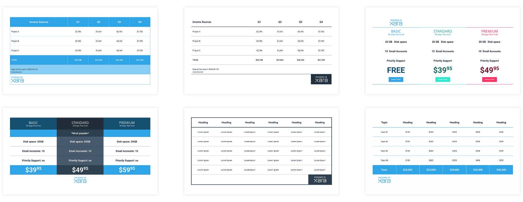 Source
When it comes to investing in a product or service, people want clarity and quality above all else. And transparency is especially important when it comes to pricing.
People want to know precisely what they are getting and how much they are getting. Without having to jump through hoops or decipher confusing jargon.
This is where tables and charts come in. Tables provide a clear and easy-to-grasp breakdown of your product’s costs and features.
Here’s the first rule: don’t go overboard with the table design. You don’t need to overcrowd the table with flashy design elements. A simple yet cohesive design will do the trick.
And remember, transparency is key. By being transparent about the costs and features of your product, you are demonstrating that you value honesty and openness in your business practices.
It’s also a good idea to ensure your pricing table is mobile-friendly. Many customers will be viewing your website and pricing table on their smartphones, so it’s important that the table is optimized for smaller screens and is easy to navigate.
While having a pricing page is crucial, it wouldn’t hurt to post your pricing plans on social media occasionally. Especially during discounts! This could be the push some people need to invest in your product.
Transform Your Data Into Visual Stories With Xara Cloud
Tables and charts are the bread and butter of presenting data in a way that’s easy to digest and engaging.
And there are plenty of ways of using them in your content strategy! But it’s up to you to make the data sing.
Not to worry – we give you the instruments to simplify data entry and content creation.
Xara Cloud empowers you to transform your data into visual stories that inspire. With our easy-to-use tools and professional templates, you can create stunning data visualizations that convey your message with clarity and impact. Xara Cloud helps you tell data-driven stories in a brand-new way. Sign up today!
Create Tables That Impress With Xara Cloud


 No credit card or phone number required.