
Blog
Expert Tips To Create Meaningful & Captivating Brand Content To Grow Your Business
Newest Article
Our top picks


All articles


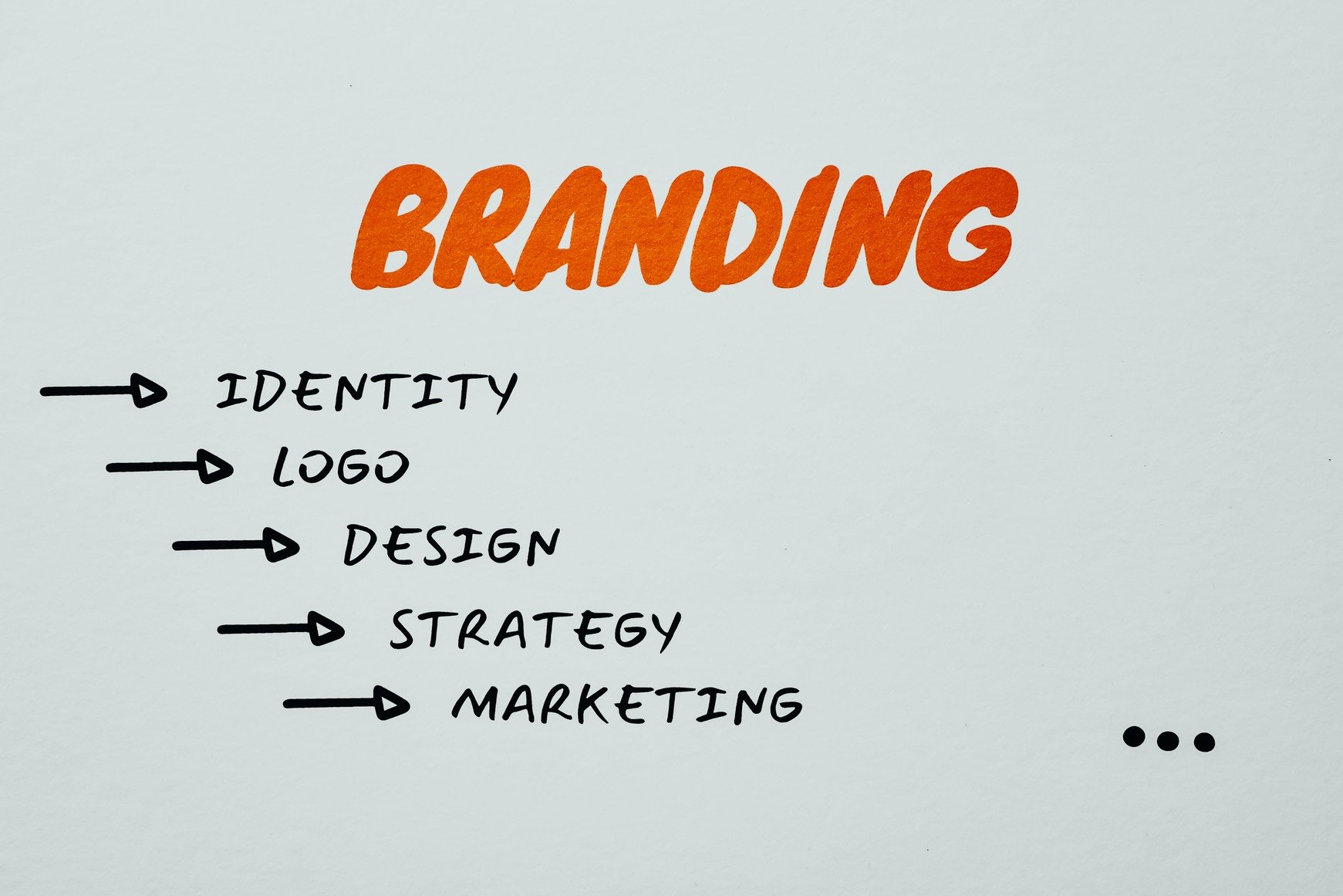


Expert Tips To Create Meaningful & Captivating Brand Content To Grow Your Business