Are you a Magix Customer?

Here's your discount
×

As seen on:

What is a bar chart?

Although it’s more common to find vertical bar charts, you’ll also come across horizontal bar charts, and in fact they can be perfect to show a large number of entries in horizontal documents.

A bar graph is formed on two axes. If you’re looking at a vertical chart, the horizontal axis will show the data categories – this could be months or years, products, etc. On the vertical axis you’ll find the numerical values. The taller the bar, the bigger the amount.

Create bar graph ⟶

When to use bar chart?

Bar charts vs pie charts

Pie charts are a good choice if you want to compare a small set of data to the whole. Bar graphs on the other hand are good if you have a larger number of data categories, particularly if there are small differences between them. For example, you could use a pie chart to visualize how different marketing channels contribute to overall business revenue (assuming the number of channels is not very large). Whereas a bar chart would be a better way to represent how much was spent on ads per month during the last year.

Bar charts vs line charts

Line charts are ideal to show trends over time. The continuity of the line allows for better visualization of more subtle differences between periods. For example, the increase in revenue month on month. Line charts are not recommended for larger data sets, since it will make harder to compare groups of data.

Type of bar charts

Vertical bar charts

uncategorized - 11342

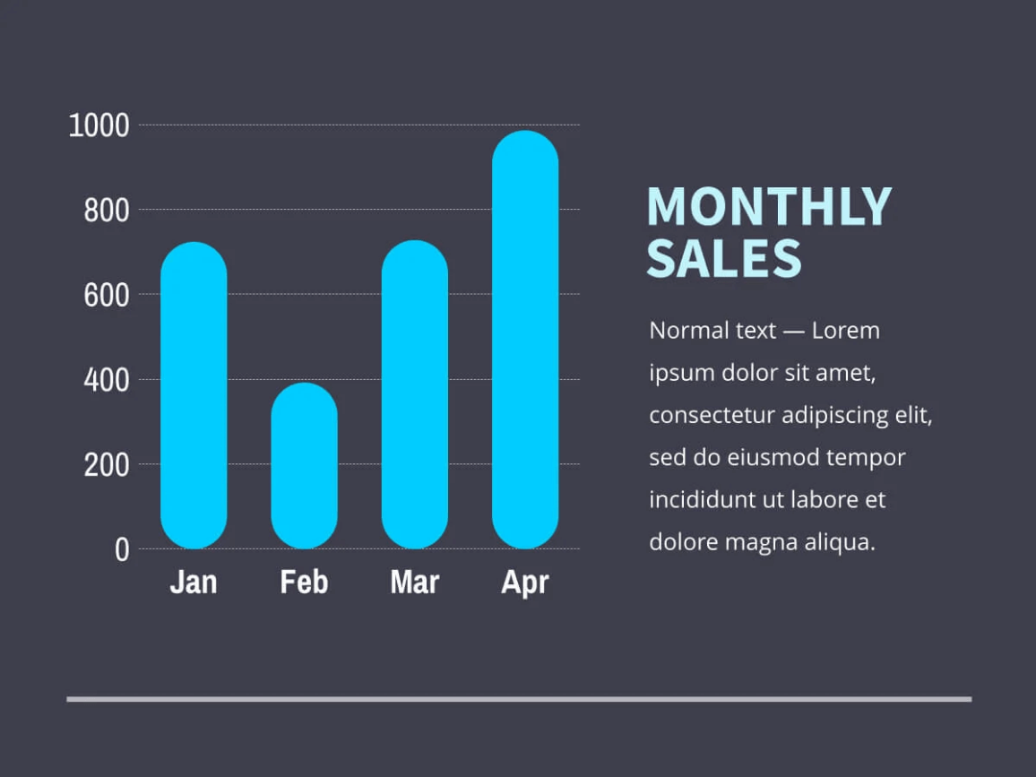
These are the most common type. They’re perfect for showing variations in sets of data and comparisons over time. In the example shown we can easily see how the sales evolve over the first four months of the year.

Horizontal bar charts

uncategorized - 11343

Nevertheless these have some benefits. For example, they’re easier to label, with more room for longer labels. Our example shows a series of marketing channels vs how much was spent on them.

Variations of the classical bar chart

Grouped bar charts — Can show data of different sub-groups of the same category. For example it could be used to group the same months of the year and compare each month, not just to other months that year but also to the same month of the previous year.

Stacked bar chart — Similar to the grouped bar chart but in this case the sub-groups are placed on top of each other in a way that makes it easier to compare both the total of the category and the sub-groups. For example it could be used to show how much was spent on different marketing channels month by month.

Expert tips to create a bar chart

Decide exactly what you want to show in your chart — Whether you’re creating your bar chart as part of a presentation for your next company meeting, or for a proposal that you’ll send to a client, you should always have a clear idea of the message you want to convey before you start.

Prepare your numbers — in a table or document so there are no mistakes.

Log in to Xara Cloud and open the document — in which you want to place your chart. If you haven’t signed up yet, you can take advantage of our free trial. If you want to use your chart stand-alone, and not in a document, you can open a blank template. You’ll be able to download your chart as a PNG, JPEG or SVG.

Click on the plus symbol, select charts and select the kind of chart you want — Vertical or horizontal. Drag the chart and drop it on your document. It will automatically adopt your document colors.

Change the sample values to your own — Also, make sure you change the sample labels to your own. You can do this by simply clicking on each text and value.

Change the look and feel — Play with the handles to adjust the width and length of bars, spacing, rounded corners, etc.

You can change the colors of your chart — but we recommend that you use the default ones since they will be consistent with the rest of your document.

Bar chart template

You can customize every detail about your Bar chart, from fonts to text colors, text size, lines, background etc.

uncategorized - 11341

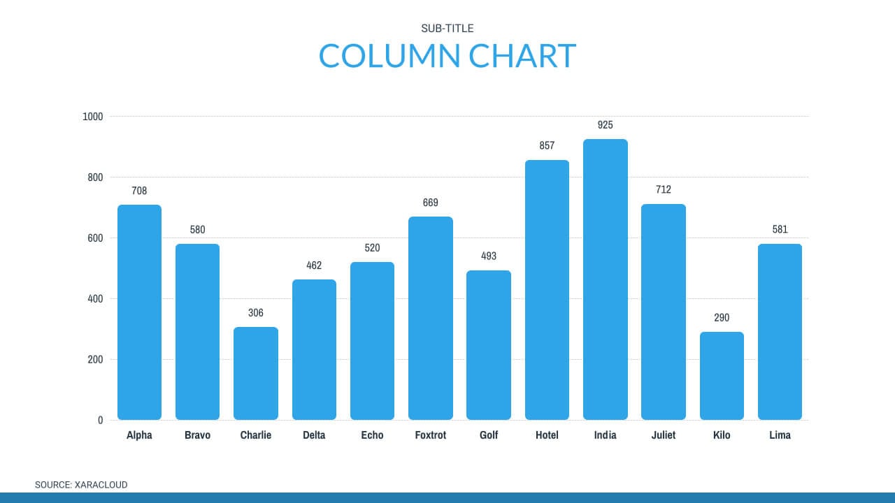
Create bar chart in Xara Cloud

In Xara Cloud charts are way more customizable than this, so you can make them a perfect fit for your brand style. Here are some of the things you can edit:
– Color of the bars, labels, legend, etc. You can personalize the color of every detail of your chart to ensure it perfectly fits the context
– Shape and width of the bars. You can even round the corners of the bars to fit your style
– Spacing between the bars. You can fit your bar anywhere by making the spacing between bars smaller or bigger.

To edit the values on your chart you can quickly and easily change the size of the bar by dragging the edge of the bar, or you can enter your numbers in the labels. The bar will automatically adjust to the desired value.

Start your free trial ⟶

uncategorized - 12217

Add impacting visuals to your marketing and business content.

GET STARTED FOR FREE No credit card required