3 min read
It’s true, the future of communications is visual. And this appears to go beyond the sight of pretty pictures. Evidence suggests that our brain is wired in order to prioritize vision over the rest of the senses. In fact, a modest 10% of the information we hear will be remembered in the following 3 days. But if we add an image, we’ll remember 65% during the same interval.
A good image also helps us remember text-based information, so it’s no wonder that 32% of marketers perceive visuals as the most important aspect of their content marketing efforts. So if you’ve figured out your brand name, your brand tagline, and your brand manifesto, you know that your branding strategy does not stop with your brand story. You should be designing your business logo as well in order to make your brand image stand out in the eyes of consumers.
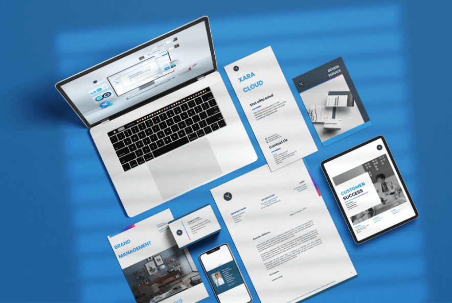
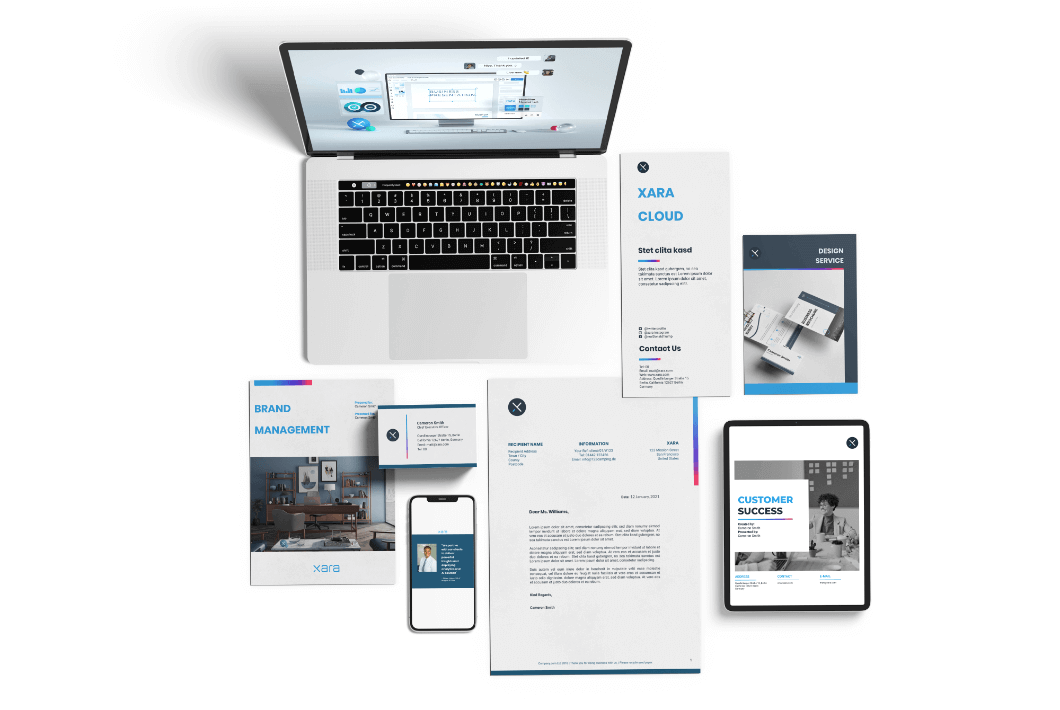
Example: Xara's brand across channels.
After all, the brand logo accompanies your brand name across all touchpoints — the product itself, social media presence, brick and mortar stores, website, email communication, and so on. Inevitably, it’s the element that springs to mind when consumers think about your brand. And getting it right is likely to contribute to better brand evaluations, purchase intentions, and brand performance, according to a study issued by the Journal of Marketing Research.
Let’s see how companies can reap these benefits with an effective logo that complements their branding efforts.
The 5 Steps Towards Logo Success
There is more to a logo than a good design. Sure, the way it looks matters and contributes to the memorability criteria. But if the design is inconsistent with the brand identity, this could do more harm than good.
Think of Gap’s logo re-design back in 2010 when the company was forced to revert to the original logo within one week due to consumer backlash. According to marketing experts, the negative reaction was triggered by the company’s attempt to redesign its logo without redesigning its product offering as well. They went for a modern look in the logo but had no products to back up the modern feel.

Example: The Gap logo redesign fails.
To make sure that your design will not be one of those unfortunate brand logo examples, here are some steps you can take into account in order to balance a good design with your brand identity.
- Step 1: Create a Narrative for Your Logo
Your brand logo does not exist in a vacuum. It should be tied to your overall brand story. You know from your brand manifesto efforts that stories are more likely to trigger an emotional response from your audience. They help you engage with prospects and, in turn, sway their purchase decisions. So before you contemplate how your logo will look, take some time to reflect on the story that supports your business. Use this knowledge as a starting point in the logo design
process. - Step 2: Put Your Brand into Words
At this point, you might wonder: when will you get to the actual design phase? Rest assured, we’ll get there. But since your logo is a visual representation of your brand, you should think of what actually describes your brand — in words. You could make a list of relevant words, think of synonyms, or conduct online searches. The goal is to narrow down your list to a handful of words that capture your brand’s
identity and are most likely to resonate with your audience.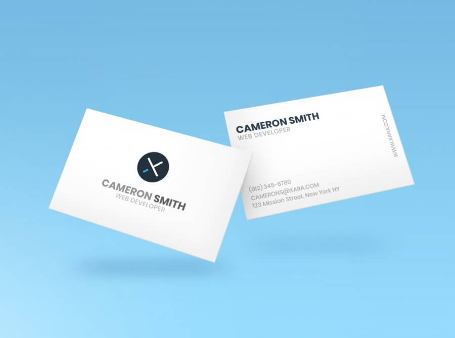
- Step 3: And Now You Sketch
Yes, now you get to work. Start from simple sketches and keep going. The goal here is not to find the perfect logo from a first try, but rather to exhaust all possible options before you settle on the final sketch. To this end, sketch whatever comes to mind, but try to keep the brand narrative and the brand words in the back of your head. Here are some general rules to have in mind:
- If it’s too complicated, drop it. As much as the logo design relies on creative input, it still has to be simple enough to resonate with your audience and help them remember you. If your sketch takes too long to complete, it’s probably not your best bet.
- Don’t neglect the color aspect. This is particularly important since your sketches are most likely conducted in pencil. Adding color to your sketch could jeopardize the intended effect you see on paper, so you should be cautious of your colors. For the best outcome, do not aim for more than 3 colors in your logo — and choose them wisely in order to help your brand stand out.
- Once your sketches are ready, share them across the organization or ask for honest opinions from friends and family. Use their input to narrow down your options and make sure you have some solid designs that fit the buyer persona.
- Step 4: Do We Have a Winner Yet?
Indeed, you need one winner sketch to advance your brand logo process. Once you’ve picked the best choice, it’s time to polish it and make it the best it could be. Use the words you identified in Step 2 that best describe your brand. Try to think of elements that could be added to the final sketch in order to 100% reflect your description.
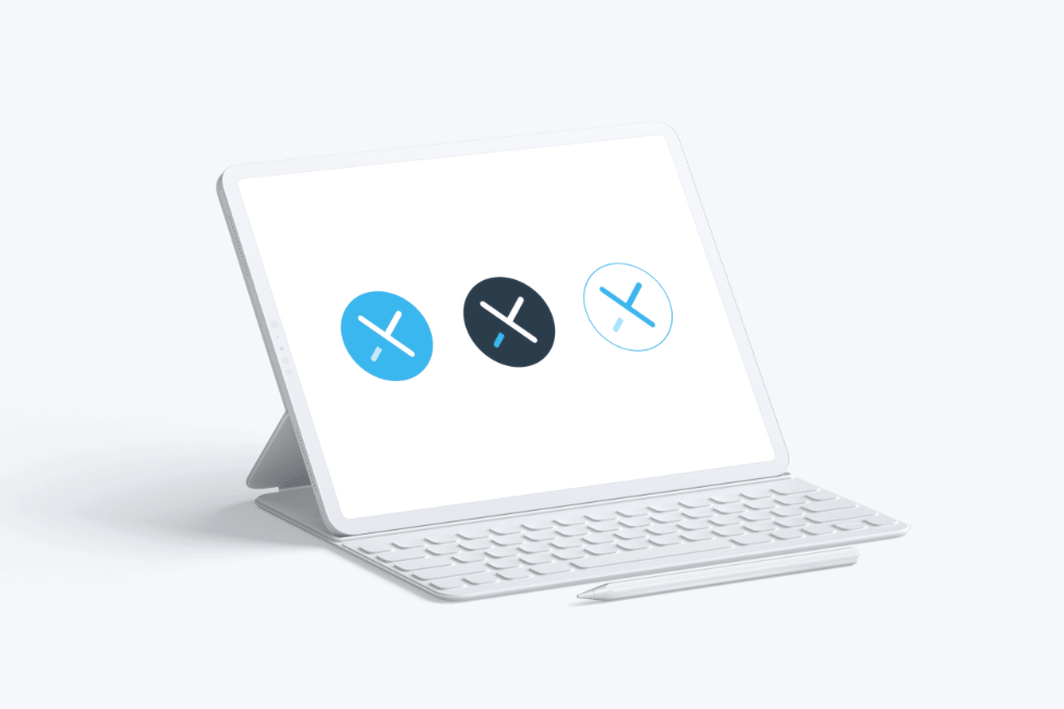
Example: Two versions of Xara logo for different use case.
- Step 5: Go Digital
In order to be able to use your logo across your brand, you need to transfer it into a digital format. There are a lot of tools out there that help you do that, but you need to consider the layout as well.
Example: Two versions of Xara logo for different use case.
How does the logo look in relation to the brand name? Is the text displayed clearly enough? Are the shapes perfectly shaped? These are all important aspects, especially since the logo should look even, no matter where you publish it — horizontal or vertical formats, on products, brand communication, and so on.
Is Your Logo Ready?
Once you have it in a digital format, you might consider yourself done with designing your own company logo. But your journey will not stop here.
The design on your computer screen, set against a white background, will look differently from the design you will see out in the world. This aspect should inform the color palette you choose for your brand and brand logo, as well as how your logo looks together with your brand name — and the font you use as you get started with this.
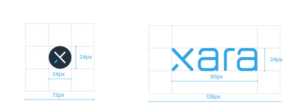
Example: A good logo should look consistent, in every formats.
And last but not least, always make sure that your logo looks consistent — at scale. You could place it on brand merchandise, brand documents, or huge billboards. The key is to have a consistent look in order to help consumers recognize you.
To some extent, you cannot consider yourself 100% done with designing your own logo. You should always be optimizing in order to make sure you achieve the best results.
The Xara branding hub
Whether you want to grasp the basics of branding for your new business, want to work on your brand strategy, are stuck with your brand visuals or want to find branding tips on how to grow your business, check out:
- Foundations — Learn the basics of branding
- Strategy — Plan your brand strategy
- Build Story — Build a brand 1: Your brand story
- Build Visuals — Build a brand 2: Your brand visuals
- Management — Control your brand: Brand management
- Growth — Grow your brand: Brand marketing
- Improvement — Improve your brand: The rebrand
- Measurement — Measure your brand: Brand analytics and KPIs