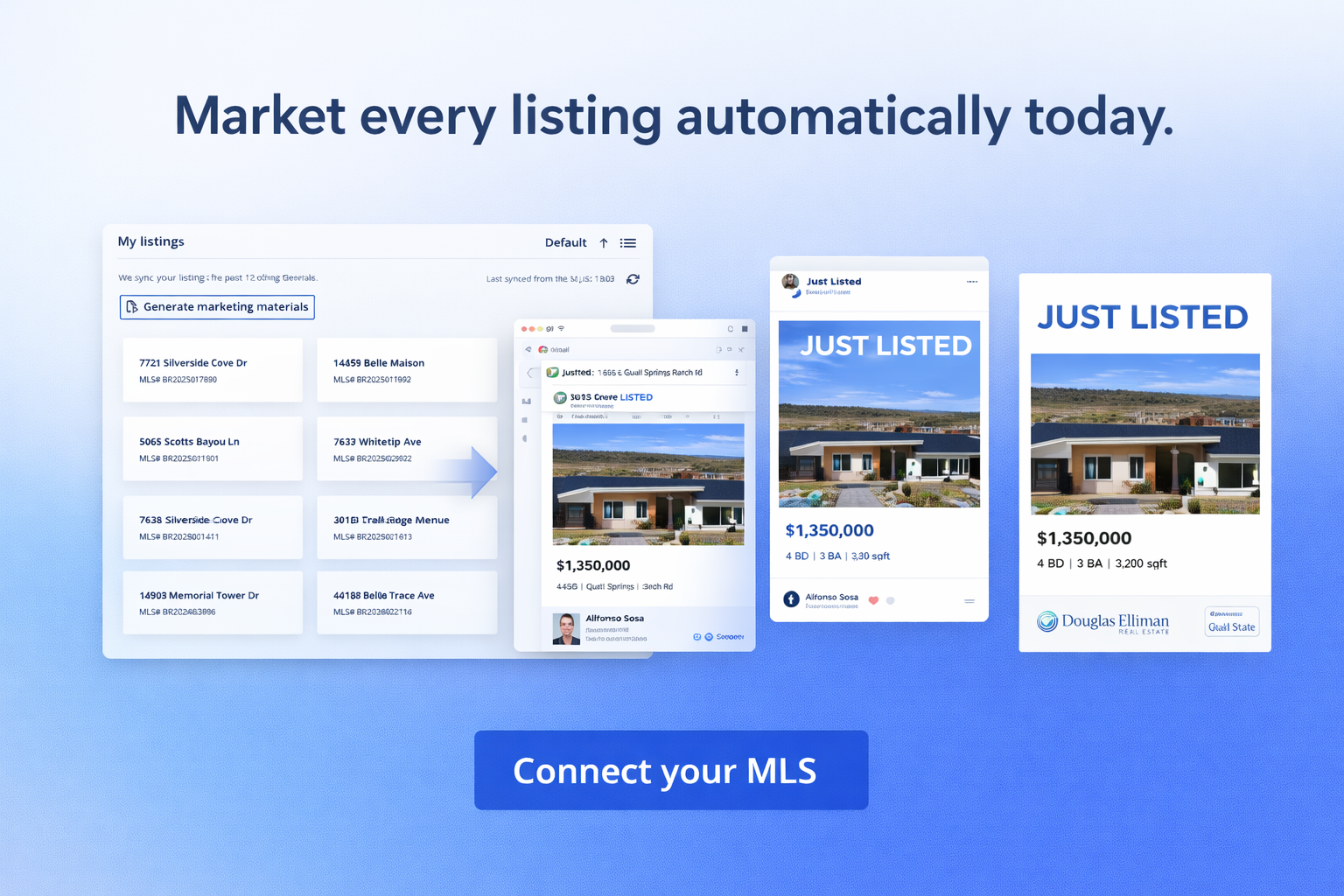
#Real estate #Real Estate Agents #Real Estate Brokers #Real Estate Listings Automation #Real Estate Marketing Introducing: Listing marketing automation, from day one.Published by Alfonso
#Automation #Marketing #Real estate #Real Estate Brokers #Real Estate Marketing #Real Estate Tips Brokerage Marketing: 10 Strategies That Help Real Estate Brokers GrowPublished by Kimberley DERUDDER
#Real estate #Real Estate Brokers 5 Best Real Estate Broker Software You Need In 2026Published by Kimberley DERUDDER
#Automation #Real estate #Real Estate Agents #Real Estate Listings Automation #Real Estate Marketing #Real Estate Tips #Social Media Instagram for Real Estate Agents: Marketing Tips & Strategies Published by Kimberley DERUDDER
#Real estate #Real Estate Marketing #Real Estate Tips 10 Must-Know Real Estate Social Media Marketing Tips for 2026Published by Kimberley DERUDDER
#Real estate #Real Estate Marketing How to Stay Ahead Using a Real Estate Marketing CenterPublished by Kimberley DERUDDER
#Real estate #Real Estate Agents #Real Estate Brokers #Real Estate Marketing What Is Automated Real Estate Marketing & How to Do It Right In 2026Published by Kimberley DERUDDER
#Real estate #Real Estate Brokers #Real Estate Listings Automation #Real Estate Marketing #Real Estate Tips Evergreen Strategies for Luxury Real Estate Marketing In 2026Published by Kimberley DERUDDER
#Real estate #Real Estate Brokers #Real Estate Tips How To Be a Successful Real Estate Broker: 8 Expert TipsPublished by Kimberley DERUDDER
#Real estate #Real Estate Agents #Real Estate Brokers #Real Estate Marketing #Website Building 9 Best Real Estate Website Builders in 2026Published by Kimberley DERUDDER
#Real estate #Real Estate Brokers #Real Estate Marketing #Real Estate Tips Tips to Achieve Brand Consistency in Real Estate That Work WondersPublished by Kimberley DERUDDER
#Real estate #Real Estate Brokers #Real Estate Marketing #Real Estate Tips Boosting Real Estate Sales: Expert Guide from the Best Marketing CenterPublished by Kimberley DERUDDER
#Real estate #Real Estate Marketing The Future Of Real Estate Industry: 9 Trends to Watch For In 2026Published by Kimberley DERUDDER
#Real estate #Real Estate Brokers #Real Estate Tips 12 Real Estate Agent Retention Tips For Brokers To Keep Best TalentsPublished by Kimberley DERUDDER
#Real estate #Real Estate Brokers #Real Estate Tips Recruiting Real Estate Agents: How To Attract & Close Top Talents In 2026Published by Kimberley DERUDDER
#Real estate #Real Estate Marketing How to Create a Real Estate Social Media Calendar with AIPublished by Kimberley DERUDDER
#Real estate #Real Estate Agents #Real Estate Brokers #Real Estate Marketing #Real Estate Tips 28 Real Estate Holidays Marketing Ideas To Steal For Your BrokeragePublished by Kimberley DERUDDER
#Real estate #Real Estate Agents #Real Estate Marketing #Real Estate Tips 7 Best Real Estate Newsletter Ideas To Convert Leads In 2026Published by Kimberley DERUDDER